








What’s your go-to setup for printing prototype cards? Reddit board game designers share their printing and paper choices:
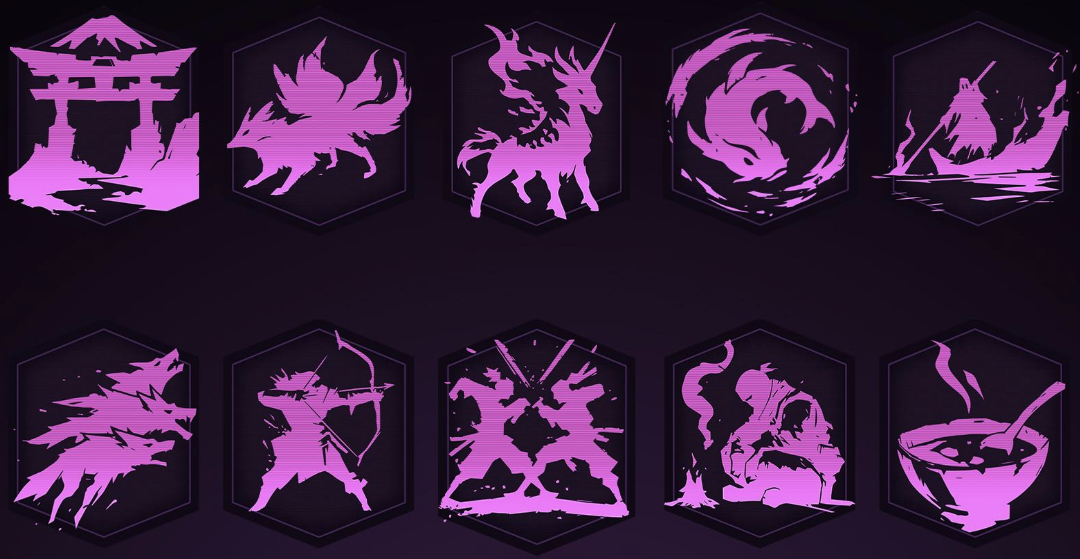
The Explorateur links to various sites exploring graphic design, typography, logos, and other visual elements, including:
logos from the space race era
vintage tech logos
fonts used in videogames
packaging design
selections from the Vatican’s archives
modern illustrations
cover inspirations
font and color combinations
What one board game designer wishes they knew when they started making games 12 years ago:
https://boardgamedesigncourse.com/what-i-wish-i-knew-about-board-game-design-12-years-ago/
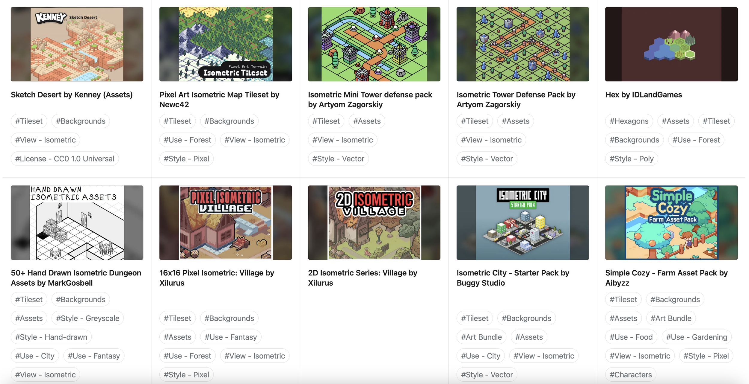
Here’s a database of free game art that people have posted to Itch.io:
https://jeremiahb.raindrop.page/database-of-free-art-69909172
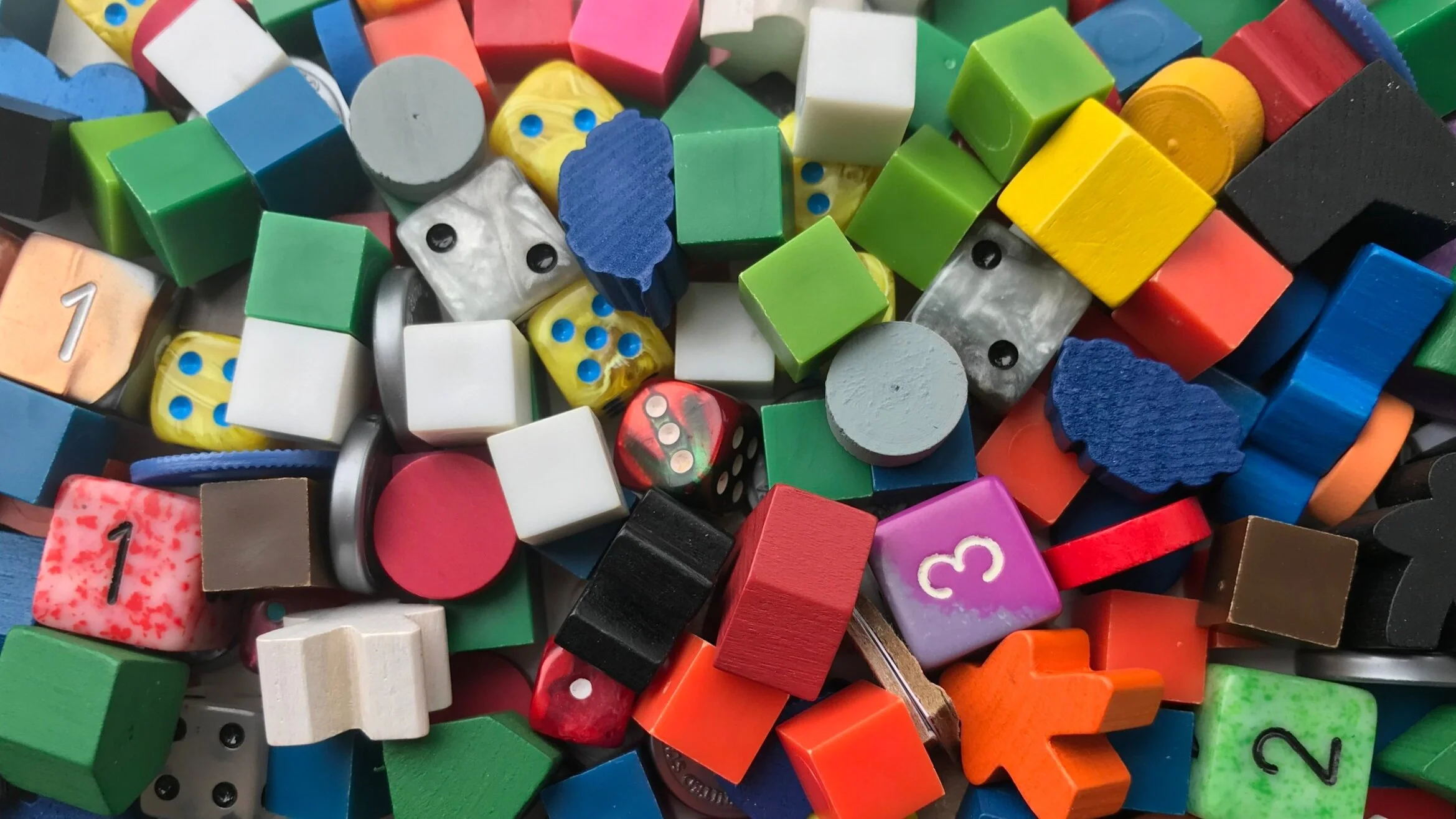
What are some of the most unusual components you have used in a prototype? A Reddit board game designers forum discussion:
https://www.reddit.com/r/BoardgameDesign/comments/1shab0a/unusual_prototype_components/